Pinned Note: Over the next week or so, my focus will be on advancing the web portal development, so these letters will be done quicker than usual. The depth of analysis, therefore, might not be up to my usual standard.
S2N Spotlight
The chart below shows the last 13 official recessions in the US and the average performance in the year before the official start and two years after. It follows the same theme as yesterday’s spotlight. As you can see, the average shows a gentle loss into the start of a recession, with the markets recovering within 2 years. As you can see in the chart below, there are some recessions that produce drawdowns of almost 60%. I would suggest you do not trade a recession according to the averages and do a deeper analysis of the nature of the recession in play.

S2N Observations
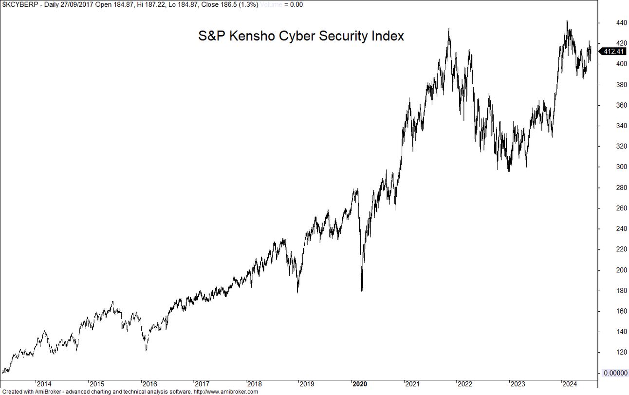
I came across this interesting index series in my Norgate data package. Kensho, an innovative AI technology company acquired by S&P Global for $550 million in 2018, has developed a fascinating set of indices. These indices focus on transformative and emerging sectors, offering investors exposure to cutting-edge themes through ETFs. I’m sharing these charts to highlight the performance of some of today’s most talked-about trends. What I found quite surprising is that some of the most talked about themes are performing very poorly.


Performance Review


Chart Gallery


News Today

The post #112: Not all Recessions are Equal appeared first on Signal2Noise.