I will be offline for another 72 hours as we wrap up the last festival in the Jewish calendar, so no letters on Thursday and Friday. After today’s letter about excess, you probably will need a break from me 😉.
S2N Spotlight
Lorie Logan is president of the Dallas Fed and the one who said in January 2024 that the Fed would look to drain liquidity from the Overnight Reverse Repo market close to zero. She gave a speech on Monday night providing further insights into the banks intended path of draining the excess liquidity in the market.
Let me start with a look at where we are with the reverse repo market. We are down to $237 billion from above $2 trillion so we are on our way.

Lorie said we should expect the continuation of this draining despite interest rates coming down. In the chart below, I show the Fed’s Reserves and Reverse REPO accounts reflecting the excess liquidity in the system. Commercial banks are required to deposit a certain amount of money to cover deposits, which is in line with reserve requirements. Then there are excess reserves, which banks hang onto either for investment purposes or for emergency liquidity. The main point I wish to make is that banks having excess reserves increases their ability to pump credit into the economy.

With this introduction, it is now easier to understand where all this excess liquidity has gone. It has gone everywhere; it has gone into the stock market, where we are experiencing all-time highs; it has gone into inflation; and I came across this series in the Fred database; it has gone into house prices. The wealth effect is alive and maybe well.
We have just hit $35 trillion in home equity. Remember the global financial crisis 2007 – 2009, caused by excessive lending? Well, the cure was to provide more lending, and for now it seems to have worked.

S2N Observations
Silver is outshining gold at the moment and is up 34% year to date; gold is up 25%.

I want to finally share a chart on market breadth. I am really happy with how this visualisation turned out. It is showing how many of the S&P 500 companies are above their 200-day moving average. What I think is pretty innovative is how I have plotted the time series on the right y-axis. I have made 50% as an imaginary zero line and inverted any reading below 50%. It took me some time, but I think it is so much easier to work with now.

If you are a Pythonista, here is the code snippet doing the magic; it may help you:
# Series 1: Data above 50%, remove portion below 50%
ma200_above_50 = ma200_data[ma200_data > 50] - 50  # Only show the portion above 50%

# Series 2: Data below 50%, inverted (bars pointing down from 50%)
ma200_below_50 = ma200_data[ma200_data <= 50]
ma200_below_50_inverted = -(50 - ma200_below_50)  # Inverted values (negative values for plotting downward)

# Plot the data above 50% as normal bars, only showing portion from 50 upwards
ax2.bar(ma200_above_50.index, ma200_above_50, bottom=50, color='lightgreen', label='#SPX%MA200 (above 50)', width=5, alpha=0.8)

# Plot the inverted data below 50% as bars pointing downwards from 50%
ax2.bar(ma200_below_50.index, ma200_below_50_inverted, bottom=50, color='lightcoral', label='#SPX%MA200 (below 50)', width=5, alpha=0.8)

# Keep the full y-axis range, but hide any ticks above 100
def custom_ticks(y, pos):
    return '' if y > 100 else f'{int(y)}'

ax2_min = data['#SPX%MA200']['Close'].min()
ax2_max = data['#SPX%MA200']['Close'].max()
ax2_range = ax2_max - ax2_min

# Set the limits so the values occupy only the bottom third
ax2.set_ylim([ax2_min, ax2_min + ax2_range * 3])
Performance Review


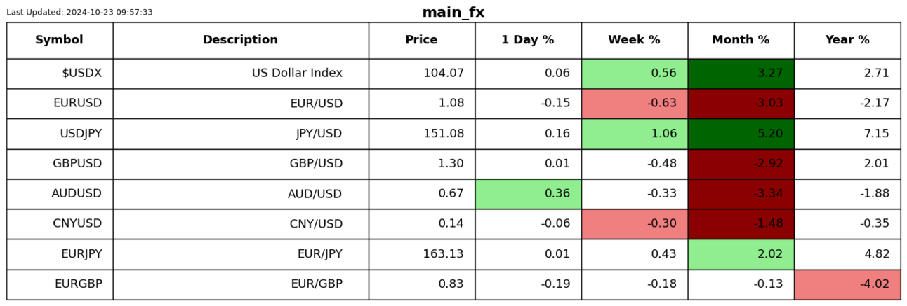
For those who are new to the letter, the shading is Z-Score adjusted so that only moves bigger than usual for the symbol are highlighted.
Chart Gallery


News Today

The post #167: Excess Liquidity Creates Excess ….. appeared first on Signal2Noise.